Media Component

The Media component is used to add a media presence to the page.
There are three display options:
- Image - Single
In this display option, a single image is displayed, accompanied by a heading, descriptive content, and an optional "call-to-action" link.
Image pixel dimensions: 1440px x 810px - Image - Slideshow
In this display option, a set of images is displayed in a "slideshow" or "carousel" format. This display also is accompanied by a heading, descriptive content, and an optional "call-to-action" link.
Image pixel dimensions: 1440px x 810px - Video
In this display option, a single image is displayed with a "play" icon overlaying the center of the image. The image displays until the "play" icon is clicked or tapped to play the video. The video is sourced from YouTube. This display also is accompanied by a heading, descriptive content, and an optional "call-to-action" link.
Image pixel dimensions: 1440px x 810px
Below are examples of each of the display options.
Open this page for editing in the CMS to see how content is entered for each of the three display options for this component.

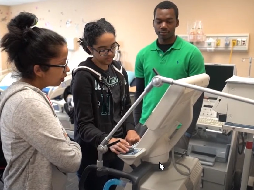
Learn in a modern clinical setting
Using modern, state-of-the-art equipment, respiratory care students gain practical, in-depth knowledge of the exact equipment in use in hospitals, clinics, and physician offices.


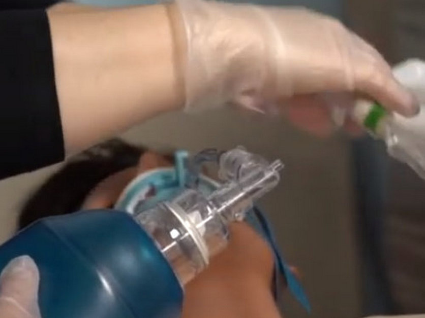
Learn in a modern clinical setting
Using modern, state-of-the-art equipment, respiratory care students gain practical, in-depth knowledge of the exact equipment in use in hospitals, clinics, and physician offices.
Meet program instructors and students
Hear what some of the instructors and students have to say about the Respiratory Care Program at Molloy College.